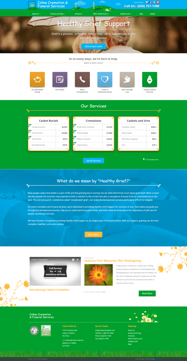
While designing websites is ultimately a fun creative process, sometimes, the process can carry a tone of seriousness to it. Colma Cremation Services wasn’t a business that came to us looking to build a website that was primarily concerned with sales as much as they were with ensuring the emotional safety of their users. Many people utilizing their site could be in a grieving process, and we needed to respect and design for that.
We began by making offerings and prices from Colma as apparent as possible by listing them predominantly on the home page. The thinking here was no one grieving for the loss of a loved one wants to click through pages and pages only to find the price of something that is in urgent necessity for closure. We also made all graphics and font rounded for a more friendly and approachable look. Most people utilizing the site are already in a state of seriousness. And while we wanted to respect that, we wanted to present a welcome tone, which is enhanced in the rounded fonts and graphics.
Keeping the user’s time in mind, we placed necessary forms online. With the multitude of forms one must file after the passing of a loved one, it can be hectic knowing where to find them, which are needed, and what to do. We created a simple and informational section of the site to streamline any experience relating to these forms so, whether the user decides to use Colma’s Service or not, they at least are shown compassion and care in their time of need. And that was really the backbone of the design process, keeping in mind the user’s experience whether looking for a direct purchase or not. Colma made clear to us it wasn’t a site for the business, it was a site for anyone out there who has recently experienced the loss of a loved one and we designed accordingly and are happy with the end product.

